The family chore app that nags rooms, not people
One day of building, one magic link, three pastel colors. How our flat got a traffic-light chore board that nags rooms, not people — and what I'd decide before the first prompt next time.
 The Procrastinator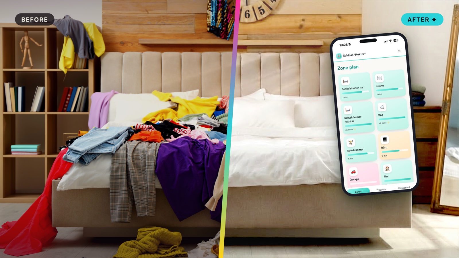
Our flat had a chore system: whoever felt guilty first, cleaned. One person did the noticing; the other did the being surprised. I'm the resident gifted procrastinator, so naturally I did what I always do with an uncomfortable problem: I built a tool instead of doing the dishes.
A chore app should nag rooms, not people.
That sentence took me longer than the code. Every chore app I tried gamifies people — streaks, points, leaderboards. In a family, that's just assigning blame with extra steps. Chores belong to rooms, and rooms have rhythms. The bathroom wants attention weekly. The windows, quarterly. Nobody needs to be the villain for that.
The problem: chores are invisible until they're overdue
The real problem is mental load: someone has to remember when each thing was last done and when it's due again. That someone becomes the household's unpaid project manager. I wanted the app to carry that memory instead, under three rules:
- Rooms, not people. The app tracks when a zone was last cared for. Who does it is a conversation, not a notification.
- Rhythms. "Every 14 days", counted in calendar days. A chore isn't late at 14:32 on a Tuesday.
- Glanceable. One look answers the only question that matters: what needs us this week?
Before the first prompt: steal these ten minutes
I didn't start in Claude. I started with two unfair advantages — and you can manufacture both in about ten minutes.
I knew what the app had to do, because we'd used Tody for a while. Tody is genuinely clever — its tiles get visibly dirtier the longer you ignore a chore, which is great, mildly passive-aggressive design. But it felt dated, it costs money, and honestly: we wanted to build our own. Knowing a reference app meant I could also decide what not to build. Schlosspflege's admin view just lists households and users. No roles, no user management. There are exactly two users, my sister and me. A full admin panel would have been homework nobody assigned.
I already had a brandbook. A while ago I'd built one for a colleague — coincidentally themed around order and tidiness — and it included notes on how an app in that world should look. Adapting it took maybe half an hour, and it's the reason the very first version came back looking right instead of like a bootstrap demo. Colors, mood, imagery: decided once, before any code, then applied everywhere. Without it, the design alone would have eaten a second day of "hmm, not quite".
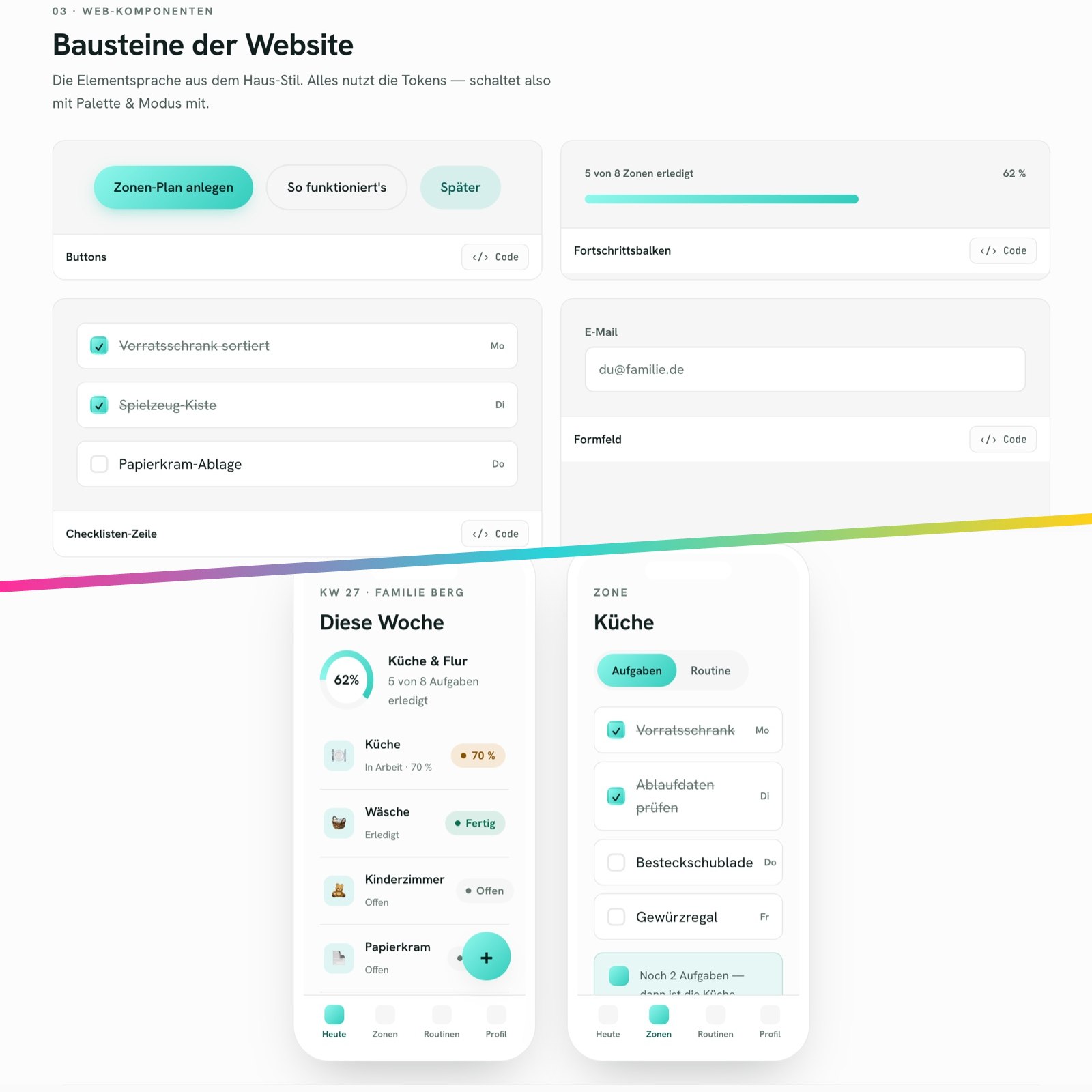
What I never thought about, at any point: the data model. I'm literally studying databases right now and it didn't matter. What mattered was thinking in rooms and people — and I got it half wrong. I started from my view of the flat: which rooms need care? Only mid-build did the obvious arrive: other people live here. My sister doesn't want to be greeted by the state of my laundry — her board should show her rooms, not mine. I'd judged the whole app through my own glasses, and retrofitting the answers cost more than asking upfront would have. So steal these four questions and answer them before you prompt anything:
- Which zones? Rooms, and how many of each — two bedrooms are not one bedroom.
- Which people? Who actually lives with this thing?
- Who may do what? Assign tasks, change intervals, invite others?
- Who sees what? The question I asked too late.
Nothing of my first PowerPoint ever survived her review. That exactly is the point of any first draft.
One more habit worth stealing, courtesy of a great boss from my project days. A first version, good or bad, forces everyone to think harder: this yes, that never, this but differently. Prompting works the same way. Keep the first prompt rough, let the wrong version teach you. And if you want the lesson before the build instead of after: hand Claude your idea and ask it to argue against it as hard as it can. It will find your "who sees what" question while it's still cheap.
Built in a day: vanilla JS and one magic link
The whole app is basically three files and a database: an
index.html, an app.js for the views, a
pure logic.js for the date math — plus Supabase for
Postgres, row-level security, and magic-link login. No
framework, no build step, no bundler. Vercel serves it as plain
static files. I described what I wanted to Claude Code and we
went from empty folder to deployed before dinner:
Family chore app, phone-first. Zones (bathroom, kitchen …) as a tile grid; each zone holds tasks with an interval in days. A task is "due" again once interval_days have passed since it was last done. Tiles show traffic-light status. Vanilla JS, no build step. Supabase: Postgres + row-level security per household, magic-link login, invite code to join a household.
That prompt is tidier than what actually happened. The first pass took about an hour and was — annoyingly — not bad, mostly thanks to the brandbook. The next two to three hours were iteration, and every round was a requirement I hadn't thought to write down: two bedrooms instead of one, plus an office and a workout room (turns out "bedroom" isn't a singleton); tasks assigned to specific people, because not everybody owns everything; and a real "this week" view, because "everything that's open" is a wall, not a plan. None of that was in the first prompt. All of it surfaced by using the thing.
The bill, since "built with AI" always sounds expensive: zero euros running costs. Supabase free tier, Vercel free tier, and it lives on a vercel.app subdomain instead of a paid domain. My Claude subscription is the big one, but that's cannons and sparrows — a standard plan would have carried this build without breaking a sweat.
The board became a traffic light — though ours had a pastel phase: rosé means a zone is due now, sand means it comes due by Sunday, mint means leave it alone.
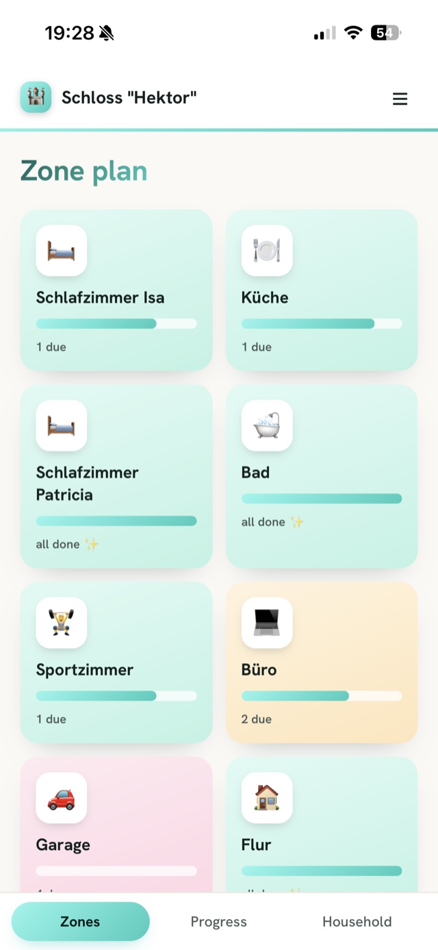
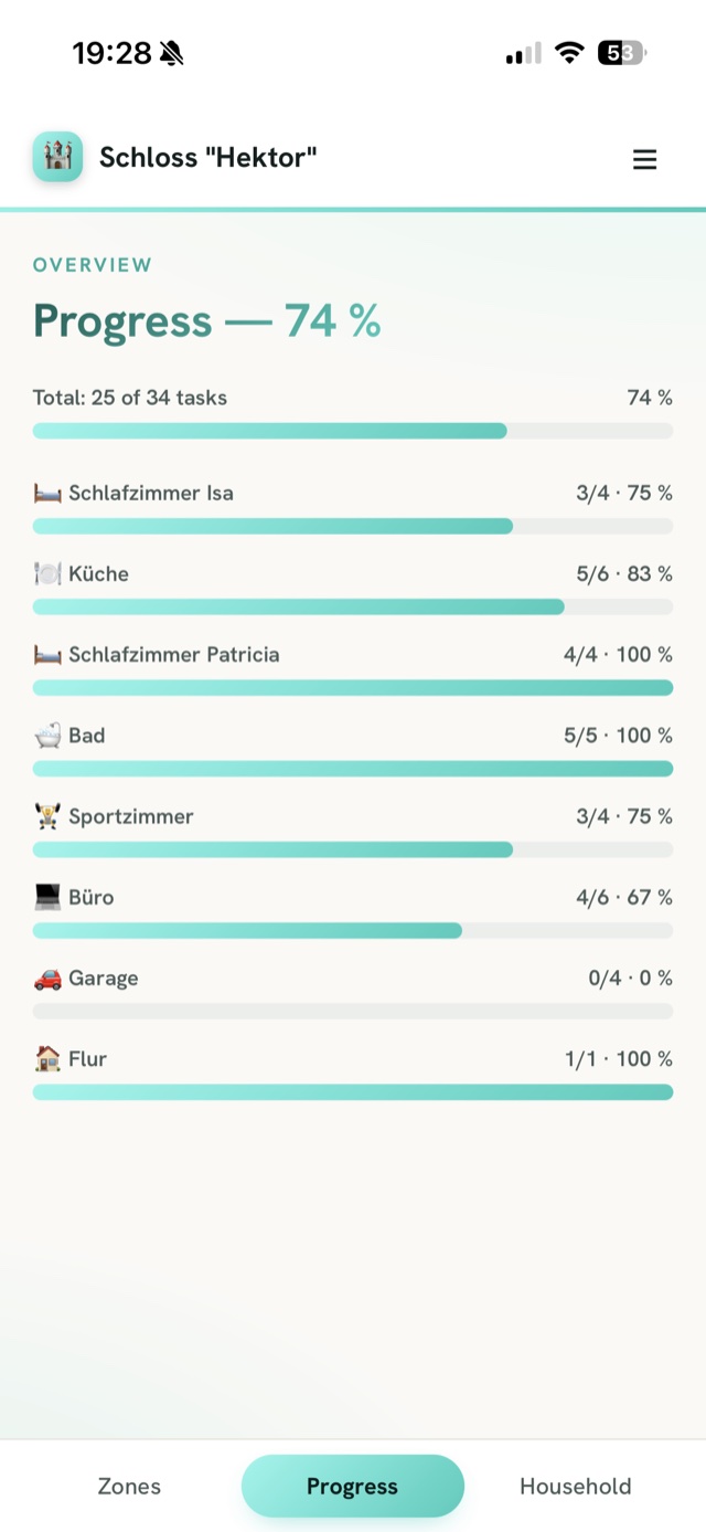
The heart of the app is one small, boring calculation. Everything else — tiles, lists, languages — is decoration around this:
// Chores run on calendar days — "every 7 days" means the day, not the minute.
const dayStart = d => new Date(d).setHours(0, 0, 0, 0);
const nextDueAt = (doneAt, intervalDays) =>
  dayStart(doneAt) + intervalDays * 86_400_000;
logic.js has no imports and no DOM — running
node logic.js executes its own little self-tests.
That's the entire test suite, and for date math you'll be glad
it exists the first time a chore silently jumps a day.
The snags: auth ate most of the day
The chore logic took an hour. Getting my family into the app is where the day actually went. I didn't understand a single one of these problems when they hit. I described what I saw. Claude did the understanding.
- I hit reload and everything went white. That's the entire bug report. It's also, almost word for word, what I typed: "I press reload and the page is white — what now?" One line of code later the app was back. There is a proper technical explanation involving something called an auth lock; I have decided to live a full life without it.
- The login link signed me in — somewhere else. App on the iPhone home screen, login link in the mail. Tap the link: suddenly I'm logged in… in Safari. The app on my home screen? Still showing the login card. The link simply opens in a different browser than the one the app lives in — that's all the theory you need. The rescue: the mail also carries a 6-digit code you type straight into the app. No detour.
- Two login emails per hour. That's what Supabase's free plan will send. A family is more than two logins, so onboarding night would have ended at sister number one. Fixed by plugging in a free mail service (Brevo) to send the mails instead. (The same free tier also once switched the whole database to read-only for a while. So. Plan around that.)
- "That function doesn't exist." The invite codes needed a random-code helper that — according to the error message — wasn't available where the app was looking for it. I pasted the error into the chat, Claude swapped the helper for a cousin that exists everywhere, incident closed. Total time: shorter than this bullet.
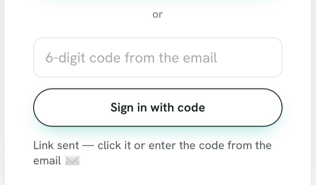
The iPhone rescue: the login mail also carries a 6-digit code — typed straight into the home-screen app, no Safari detour.
And then the snag that actually annoyed me — and it wasn't technical. Late in the day I noticed the app said "this week" in big letters while no screen actually answered what's due this week. So we built that view, and it promptly delivered a list long enough to cancel the whole project's motivation on the spot. A fresh install assumes every chore is due right now. A real household isn't a fresh install — the windows were cleaned three weeks ago, the mattress got flipped last month. Mark all of that "done today" and the app starts its life on a lie; leave it, and week one buries you. What a chore app needs is backdating: "done — but back then."
The first fix made me type dates by hand. In US format. Sorry, no. One iteration later there was a date picker — not a pretty one, but a working one, and pretty is a later iteration. That's the whole shipping-before-dinner deal. While we were in there, changing a task's interval — every two weeks, no wait, every three — became one tap on the task instead of delete-and-recreate.
What I learned: boring ships before dinner
- The social design is the hard part. "Nag rooms, not people" shaped every screen — and no framework could have made that decision for me.
- Ask "who sees what?" before you prompt. Zones, people, permissions, views — four questions, ten minutes, and you skip the expensive retrofit. I answered them mid-build; you don't have to.
- Build for the users you actually have. Two people don't need user management. The admin view is a list, and that's plenty.
- Onboarding beats features. Backdating and one-tap interval edits did more for daily use than any new screen.
- Auth was one line in the prompt. It's also all four snags above. Plan the day around that.
Shipped before dinner. Dinner was late. ✦
The app is called Schlosspflege — German for "castle care". It's a regular flat, but you maintain what you've got. Is it finished? It sits at a comfortable 85% — the remaining 15% is perfectionism wearing a to-do list as a disguise. Building a chore tool and doing the chores are two different hobbies. The laundry did not fold itself while I wired up the date picker. Next up, we feed the board its first real, backdated dates — which is the job it was built for. If you want to see how the sausage is made, the code is public — fork it and build your own.
Enjoyed this case study?
Every Sunday I send a new build with its story — short, honest, free.