Building a Custom Ghost Theme With AI — No Code Skills
I paid $90 for a premium Ghost theme and still didn't like my own blog. So I let Claude Code build a new one — four working days, zero lines of code written by me, live now.
 The Procrastinator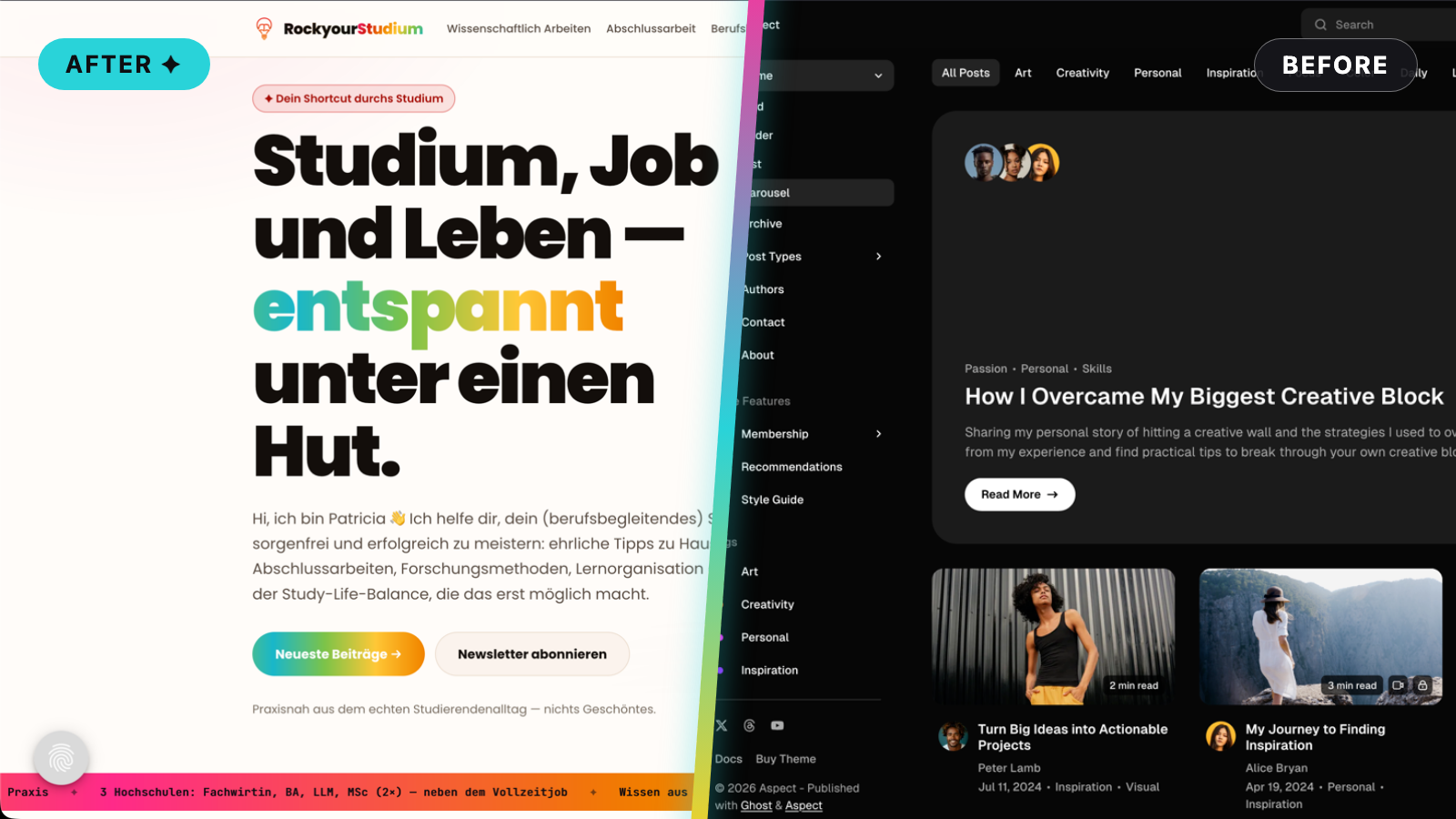
My German study blog ran on a $90 premium magazine theme. It had 18 posts and looked busier than a newsstand. I had a week of vacation. You can guess the rest.
Building a custom Ghost theme with AI takes about four working days and a Claude subscription: define your design system first, let Claude Code write the theme, and validate with Ghost's free gscan checker until it says zero errors. No coding skills required — a plan is.
- Time
- ~4 working days
- Cost
- Claude Max + 1 top-up for Fable 5
- Difficulty
- Beginner (bring patience)
- Stack
- Ghost Pro · Claude Code
What you're building: your own production Ghost theme
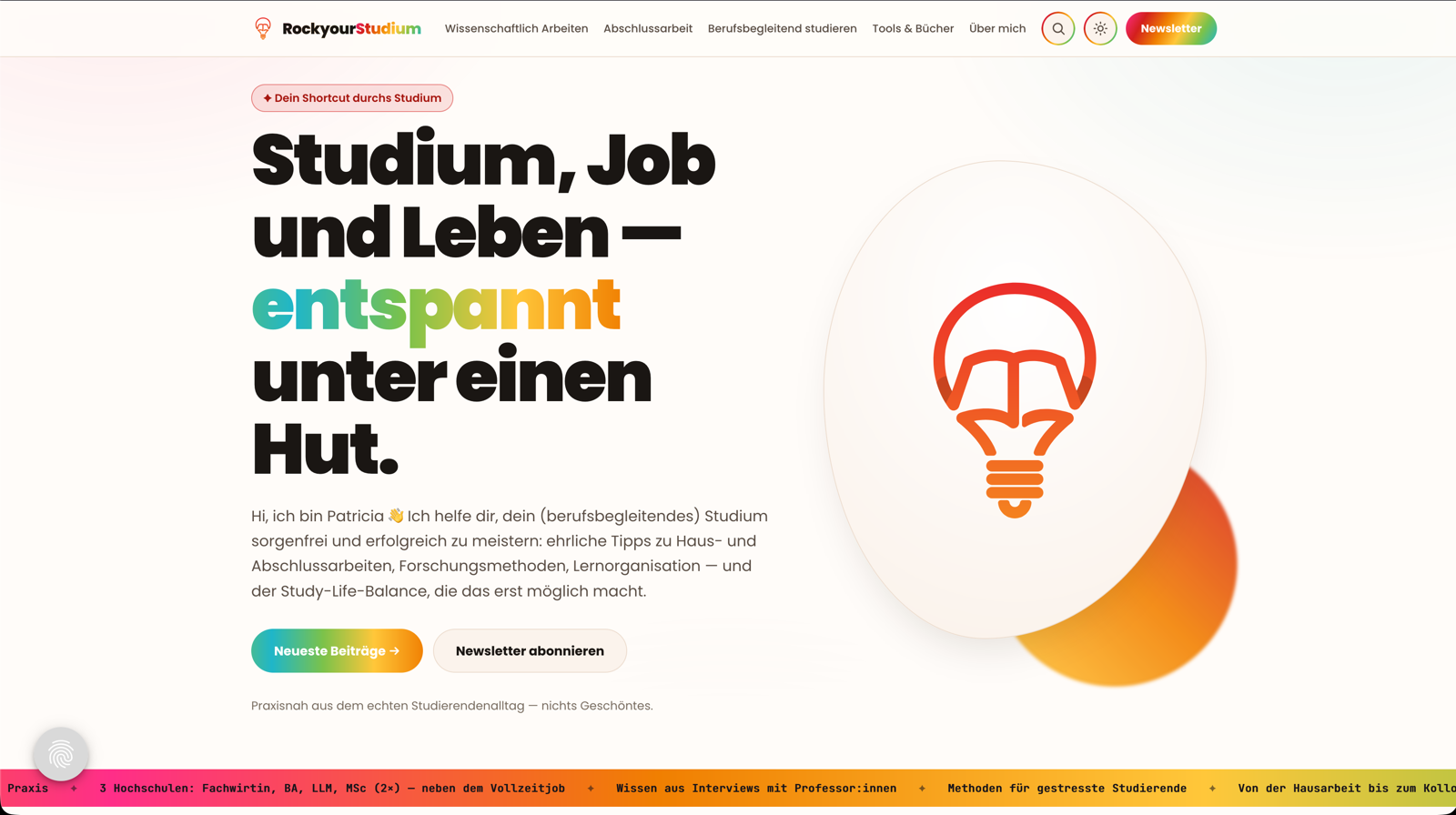
The finished theme runs a real site — rockyourstudium.de, my German study blog, live since July 2026. A build like this gets you: a homepage that shows a handful of posts instead of all of them at once, a light/dark toggle, hero images that recolor themselves in dark mode, and a scrolling marquee banner. Yes, there's a chance a rainbow jumps in your face. Life needs more color.
The point isn't that it's prettier than the old theme — let's be honest, it is, and a lot more structured instead of a cluttered mess. And when something bothers you, you describe the change and it gets done.
Build it yourself: seven steps, one prompt that matters
Build it yourself
-
Audit the site you have before you touch anything
Screenshot every page. Write down what bothers you, what stays, where you want to end up. I skipped this — it's my only real regret (see the snags).
-
Define colors, buttons and gradients before any
prompt
One brand file: colors, fonts, corner radius, what gets a gradient and what never does.
-
Hand Claude the whole design system, not pieces
Every rule you hold back returns later as a pile of tiny fix-it prompts. Ask me how I know.
-
Let Claude Code build and show you every change
Claude writes the theme and runs a local preview. You look at pages instead of code and say what you see.
-
Validate with Ghost's free checker until it says
zero
gscan tests your theme against the current Ghost version. Run it until it says zero.
-
Make Claude grade its own work before you trust
it
Before you ship, make Claude audit the whole thing — the closest a non-coder gets to a code review.
This is the current state of the theme. Grade it honestly: what did you build, what did you skip, what would you do better? The end result has to be a good website — {SEO, performance, accessibility} included. List the top issues, then fix them one by one.
-
Upload the zip, click through everything, ship at
90%
My older posts still wear the old styling. The site shipped anyway.
Why a $90 theme still wasn't doing it for me
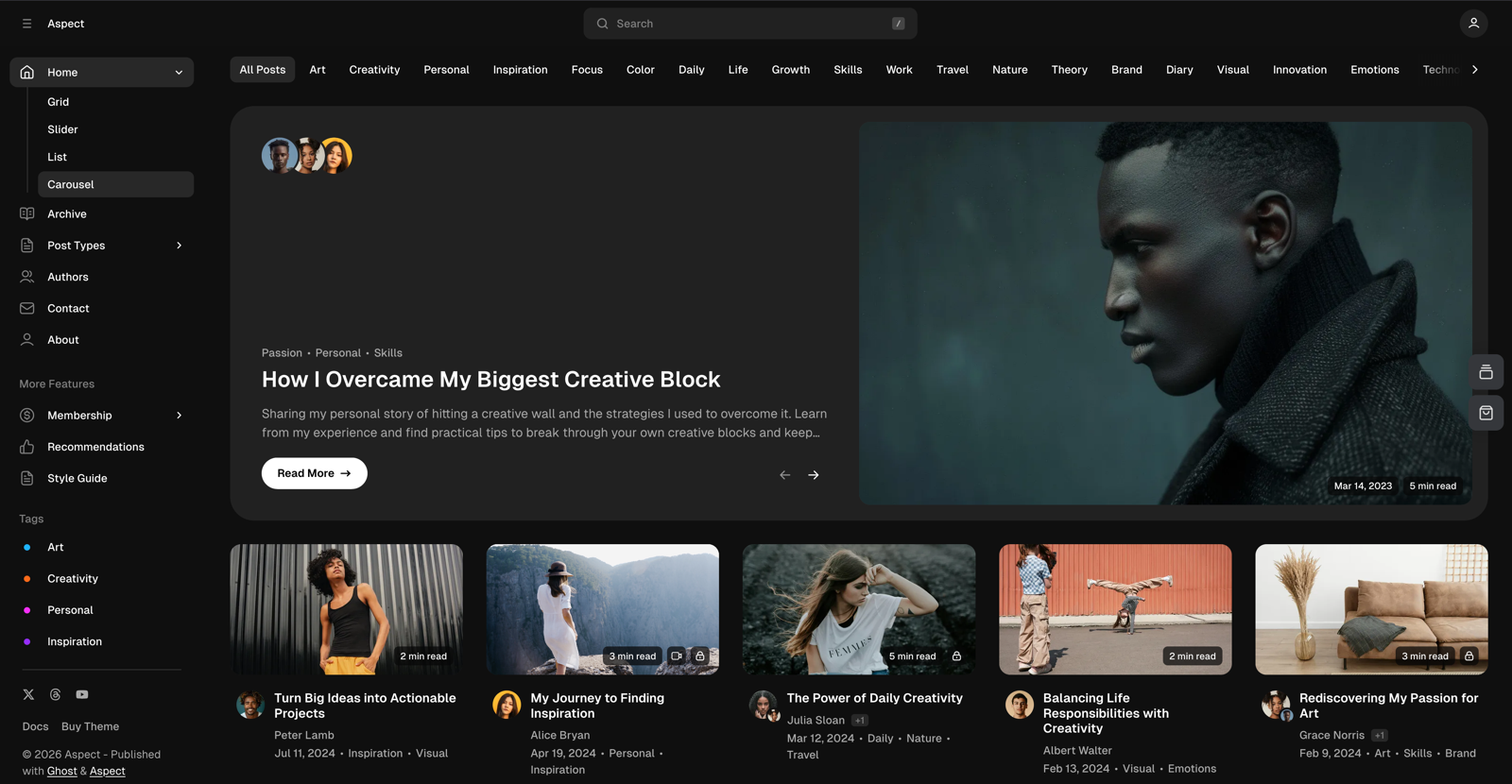
To be fair, the old theme earned its $90 once: what sold it was the tag sidebar — every topic listed on the left, each with a little rainbow dot in front. Charming, tidy, promising. But the theme was built for multi-author digital magazines. On a site with 18 posts and exactly one author, that meant a homepage firing everything at once: carousel, tag battery, author gallery. Plus the same face in every author box, like a very small newsroom.
Changing any of it means touching theme code. The developers were genuinely helpful and quick to answer. But "email support and edit files by hand" is not plug and play. Day-job aside: as a business analyst I've spent years around banking software, and the systems that hurt most are the off-the-shelf ones customized beyond recognition — every tweak makes the next one more expensive. A heavily customized theme is the same story in miniature.
So why not just buy a different theme? Because if you already know what your site should look like (colors, mood, layout for two brands, in my case), every off-the-shelf theme means bending that vision to someone else's template, with the serious manual work on top. After years of DIY web design across WordPress, Joomla and Ghost, I didn't want another rental.


Brand book first: the decision that paid for itself
Before this theme existed, the brand file existed: colors, typography, button styles, and rules for what gets a gradient and what never does. Write yours once, before any prompt. Not for one build: so that everything pulls from the same source. Site, social templates, thumbnails.
That's the real reason four days are enough. Even if it isn't finished: your brand book is adaptable and you can always add to it. Either way, Claude never has to guess your taste; it gets rules. "Primary buttons look like this, headings take the gradient, body text never does" is a spec. "Make it look nice" is a coin flip.
This build also ran the counter-experiment, involuntarily: the handful of rules that didn't make it into the prompt (which elements glow, how buttons behave) came back at the end as a full day of one-line fixes.
An afternoon of written rules beats two hundred "a bit more pink, please" prompts.
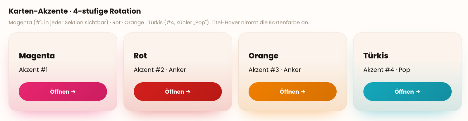
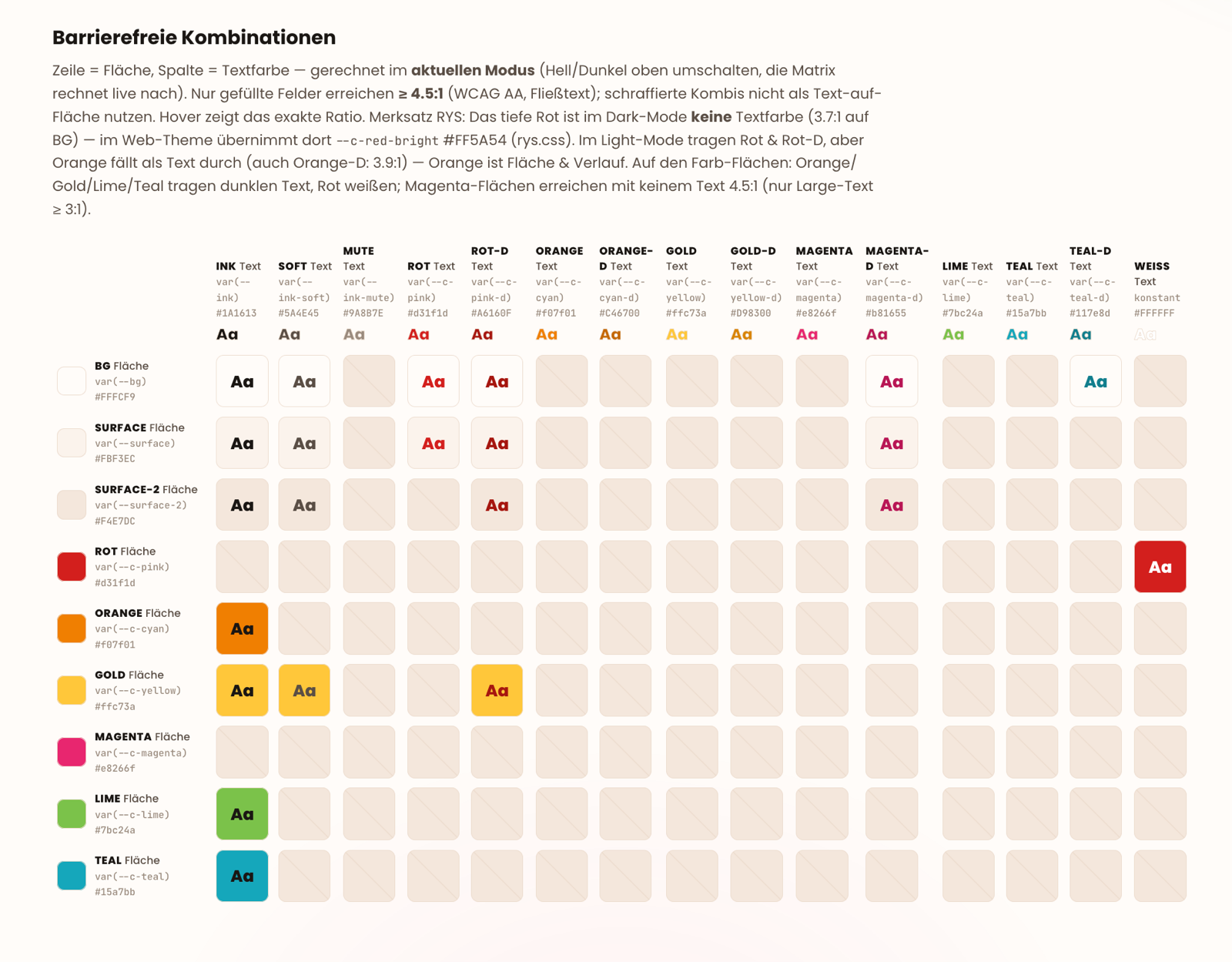
By the way: Google judges your website's contrast, too — better to fix it upfront.
Where the four days went — and the honest bill
For honesty's sake: this wasn't one heroic vacation sprint. The rough timeline — half a day, weeks earlier, to set up the base; one full day configuring the theme top to bottom; one and a half days of refinement, including the self-grading loop from step 6; and a full day of fixes at the end.
Now the math, because "AI built my website" always sounds free and never is. The old way: $90 for the theme, plus your evenings adapting it, plus developer support for anything structural. This way: a Claude Max subscription month, one extra token top-up for Fable 5 (the build ran dry mid-day once — that's real), and four working days.
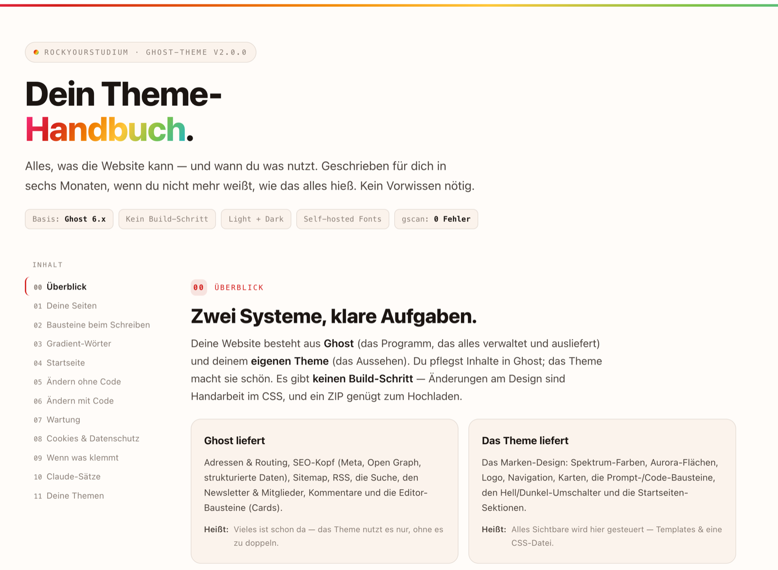
Cheaper? Barely, if at all. Yours? Completely. The next change costs a sentence instead of a support ticket, and nobody can discontinue, re-license, or redesign your theme out from under you. This one even shipped with its own handbook, written for future me, with ready-made sentences to hand Claude for the next change.
The snags: the menu that just wasn't there
The build itself ran smoother than expected. Two things ate the buffer — both carry a lesson you can reuse:
- The navigation vanished. Menu configured in Ghost admin, theme uploaded — and the page showed no menu at all. No error, nothing broken, just… no menu. The move that works: tell Claude what you see, word for word ("the menu is set in admin but the page shows none"). It took a longer back-and-forth than anyone enjoyed (more than an hour just for this). Current Ghost versions quietly hand themes empty menu data the old-fashioned way, so Claude rewrote how the theme asks for it. Could I explain the fix? No. Did I need to? Also no.
- Death by a thousand gradients. The last day went to micro-fixes, more than I bothered counting: this button should glow, that line shouldn't, this heading takes the gradient, that one doesn't. None took five minutes; together they took a day. And in the end — not all of them are caught yet. Root cause: those rules existed in the brand book and never made it into the prompt. Step 3 exists because of this.
You don't have to debug — you have to describe.
The theme is live. And the posts are getting updated. ✦
Honest status: the theme is live and validated, and the older posts still wear the old styling. They get restyled one by one, the kind of task that survives on a to-do list for months. If you build your own, start with the audit this build skipped: screenshot your old site first. You'll want the before picture — this post doesn't have one, and it stings. If the gradient rules made you curious, the CS Lab has an interactive linear-gradient playground to poke at. And the family chore app build shows the same brand-book-first trick on a one-day scale.
Enjoyed this case study?
Every Sunday I send a new build with its story — short, honest, free.